Here is a brief summary of the ZoomCharts new release v1.5:
• Introduction of four types of Geo Chart
Pie Chart on Geo Chart
Geo Chart Layers
Net Chart on Geo Chart
Droplet Shapes and Custom Map
- API is stable but is a subject to change
- uses Leaflet with the ability to use any map engine supported by Leaflet such as OpenStreetMap, Google Maps, Bing Maps, ESRI WMS services
- native Net chart integration (nodes and links with geographic coordinates)
- supports custom shapes (such as countries/regions) with an automatic drilldown
- supports auto-aggregation of nodes
- supports integration with other chart types (Pie/Time/Facet) with the Net chart on Geo chart.
- smart dynamic/floating node layout with fixed anchor points
• TypeScript definition file for chart API
- provides compile time check of API and settings schemas if TypeScript is used
- can be used to get auto-complete functionality for JavaScript in IDEs that support it such as WebStorm or Visual Studio Code
• Ability to render multiple charts on the same canvas
• Breaking changes
- ‘dataFunction’ can no longer directly return value, instead ‘success’ delegate must be always used
• Deprecated functions
- for the Time Chart ‘serverTime’ is deprecated in favor of ‘timeZoneOffset’
• Net Chart
- hierarchical layout mode added.
- improved animation algorithms
- support custom shapes for nodes (user specified rendering methods)
- additional built-in node in the shape of a droplet
• Pie Chart
- ability to swipe to select slices
• Time Chart
- candlestick series type
- ability to specify the time zone offset separately for data and series
• Facet chart
- chart display buttons that indicate the additional data can be revealed by swiping
Check out ZoomCharts products:
Network Chart
Big network exploration
Explore linked data sets. Highlight relevant data with dynamic filters and visual styles. Incremental data loading. Exploration with focus nodes.
Time Chart
Time navigation and exploration tool
Browse activity logs, select time ranges. Multiple data series and value axes. Switch between time units.
Pie Chart
Amazingly intuitive hierarchical data exploration
Get quick overview of your data and drill down when necessary. All in a single easy to use chart.
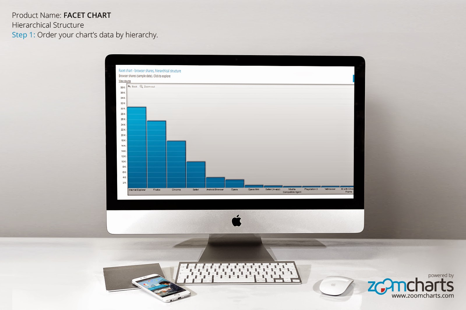
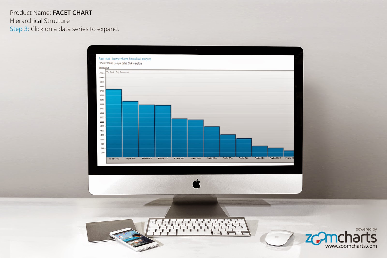
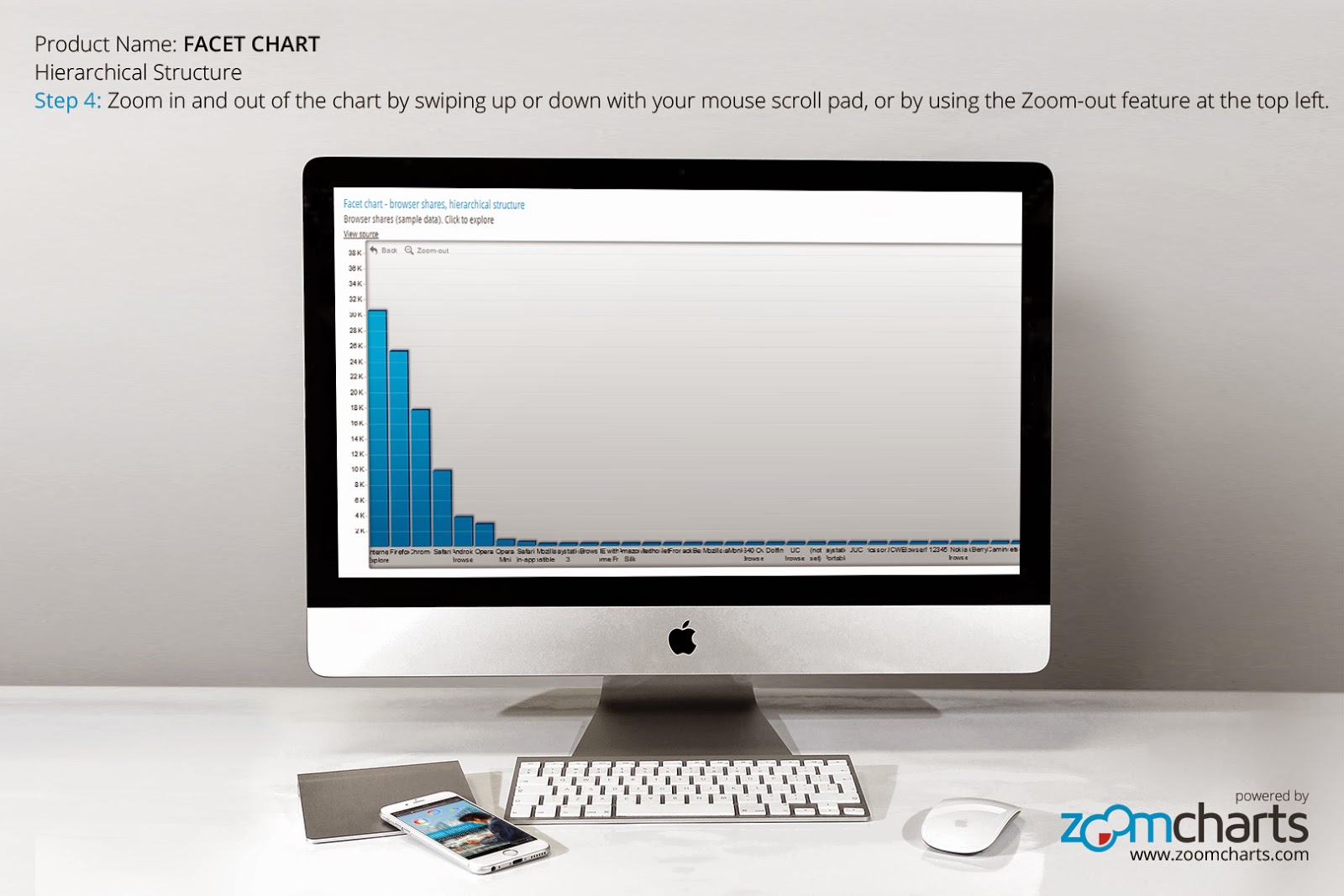
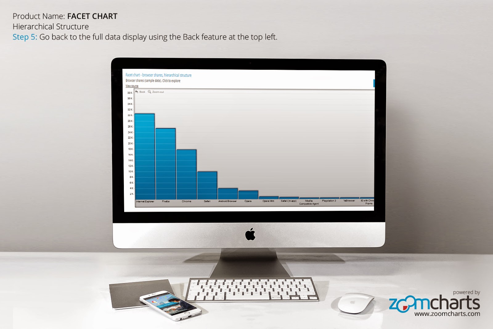
Facet Chart
Scrollable bar chart with drill-down
Compare values side by side and provide easy access to the long tail.
Geo Chart
See aggregated data for national GDPs for regions and countries
Zoom in for more detailed data splits.
ZoomCharts
http://www.zoomcharts.com
The world’s most interactive data visualization software