Showing posts with label time chart. Show all posts

Thursday, May 28, 2015

ZoomCharts Software Release v1.5

ZoomCharts is rapidly growing because of the increasing number of businesses and professionals that choose working with our interactive data visualization software which allows exploring ins and outs of the big data in the way that is comprehensive and very intuitive.


Here is a brief summary of the ZoomCharts new release v1.5:

• Introduction of four types of Geo Chart

Pie Chart on Geo Chart


Geo Chart Layers


Net Chart on Geo Chart


Droplet Shapes and Custom Map


- API is stable but is a subject to change
- uses Leaflet with the ability to use any map engine supported by Leaflet such as OpenStreetMap, Google Maps, Bing Maps, ESRI WMS services
- native Net chart integration (nodes and links with geographic coordinates)
- supports custom shapes (such as countries/regions) with an automatic drilldown
- supports auto-aggregation of nodes
- supports integration with other chart types (Pie/Time/Facet) with the Net chart on Geo chart.
- smart dynamic/floating node layout with fixed anchor points

• TypeScript definition file for chart API

- provides compile time check of API and settings schemas if TypeScript is used

- can be used to get auto-complete functionality for JavaScript in IDEs that support it such as WebStorm or Visual Studio Code

• Ability to render multiple charts on the same canvas

• Breaking changes

- ‘dataFunction’ can no longer directly return value, instead ‘success’ delegate must be always used

• Deprecated functions

- for the Time Chart ‘serverTime’ is deprecated in favor of ‘timeZoneOffset’

• Net Chart

- hierarchical layout mode added.
- improved animation algorithms
- support custom shapes for nodes (user specified rendering methods)
- additional built-in node in the shape of a droplet

• Pie Chart

- ability to swipe to select slices

• Time Chart

- candlestick series type
- ability to specify the time zone offset separately for data and series

• Facet chart

- chart display buttons that indicate the additional data can be revealed by swiping

Check out ZoomCharts products:

Network Chart
Big network exploration
Explore linked data sets. Highlight relevant data with dynamic filters and visual styles. Incremental data loading. Exploration with focus nodes.

Time Chart
Time navigation and exploration tool
Browse activity logs, select time ranges. Multiple data series and value axes. Switch between time units.

Pie Chart
Amazingly intuitive hierarchical data exploration
Get quick overview of your data and drill down when necessary. All in a single easy to use chart.

Facet Chart
Scrollable bar chart with drill-down
Compare values side by side and provide easy access to the long tail.

Geo Chart
See aggregated data for national GDPs for regions and countries
Zoom in for more detailed data splits.

ZoomCharts
http://www.zoomcharts.com
The world’s most interactive data visualization software

Tuesday, March 31, 2015

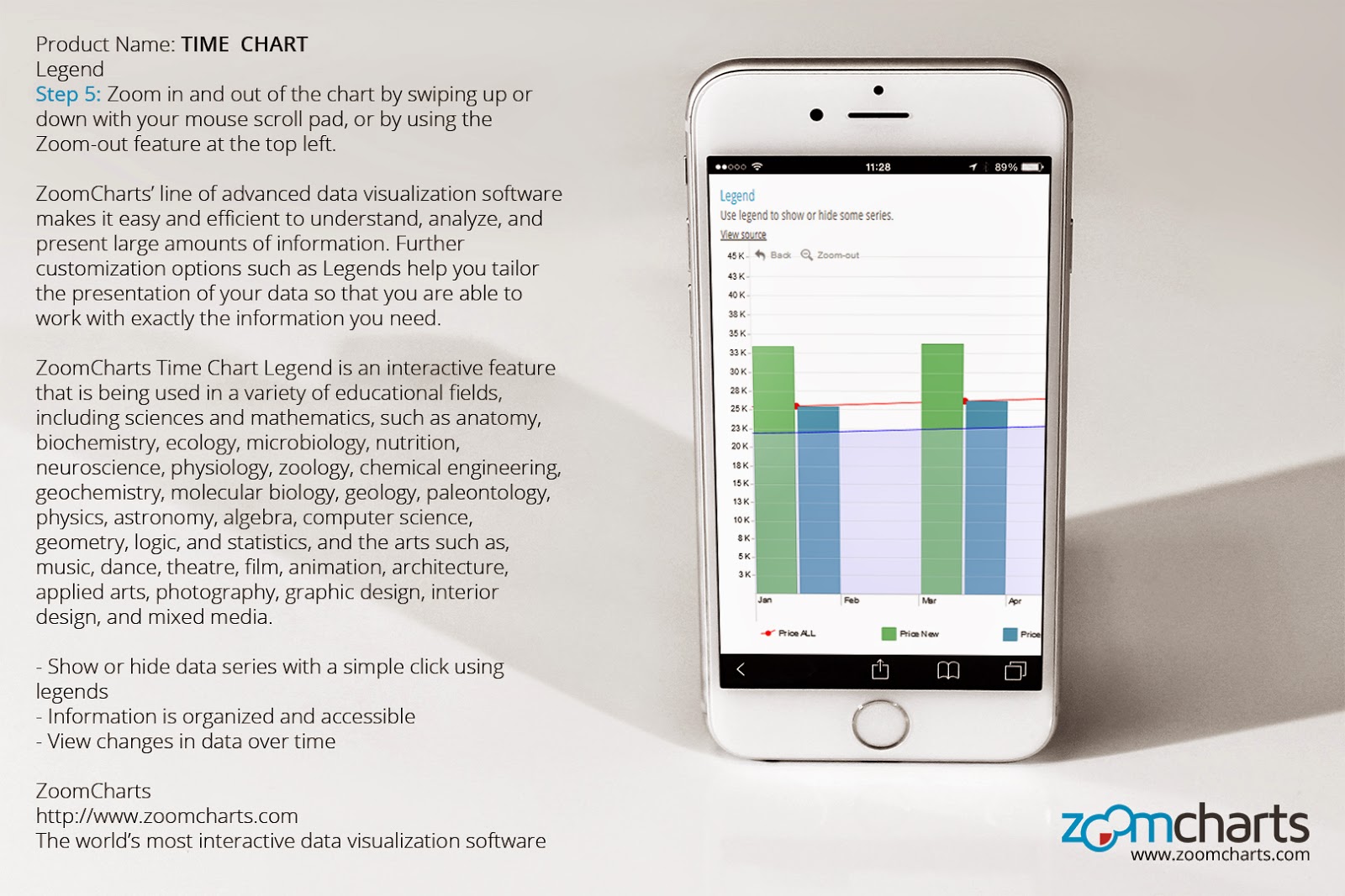
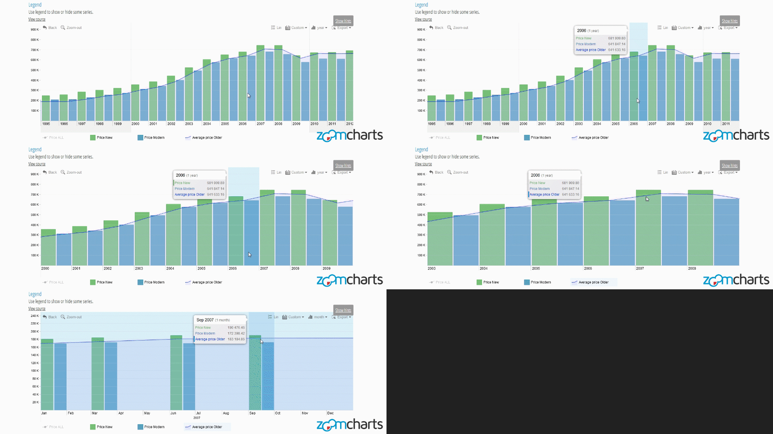
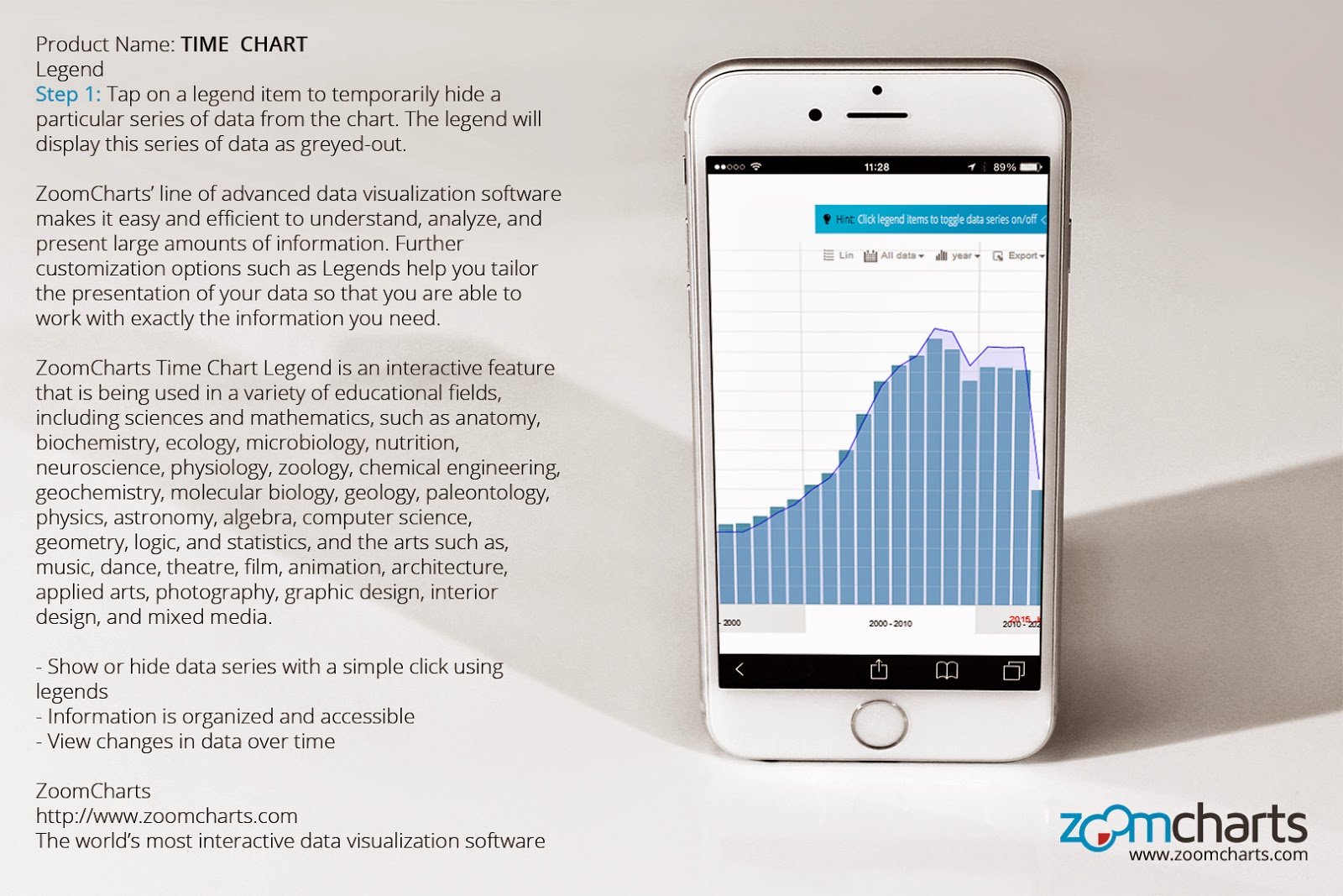
How to Use ZoomCharts Time Chart Legend on iPhone


https://zoomcharts.com/en/gallery/all:time-chart-legend

ZoomCharts’ line of advanced data visualization software makes it easy and efficient to understand, analyze, and present large amounts of information. Further customization options such as Legends help you tailor the presentation of your data so that you are able to work with exactly the information you need.

ZoomCharts Time Chart Legend is an interactive feature that is being used in a variety of educational fields, including sciences and mathematics, such as anatomy, biochemistry, ecology, microbiology, nutrition, neuroscience, physiology, zoology, chemical engineering, geochemistry, molecular biology, geology, paleontology, physics, astronomy, algebra, computer science, geometry, logic, and statistics, and the arts such as, music, dance, theatre, film, animation, architecture, applied arts, photography, graphic design, interior design, and mixed media.

- Show or hide data series with a simple click using legends
- Information is organized and accessible
- View changes in data over time


Step 1 Tap on a legend item to temporarily hide a particular series of data from the chart. The legend will display this series of data as greyed-out.


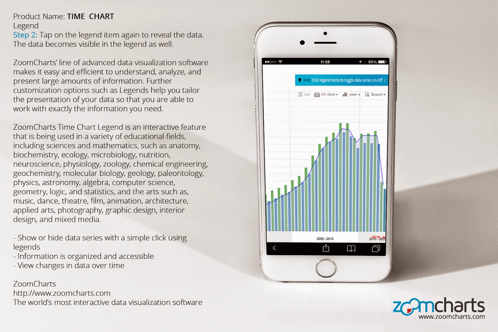
Step 2 Tap on the legend item again to reveal the data. The data becomes visible in the legend as well.


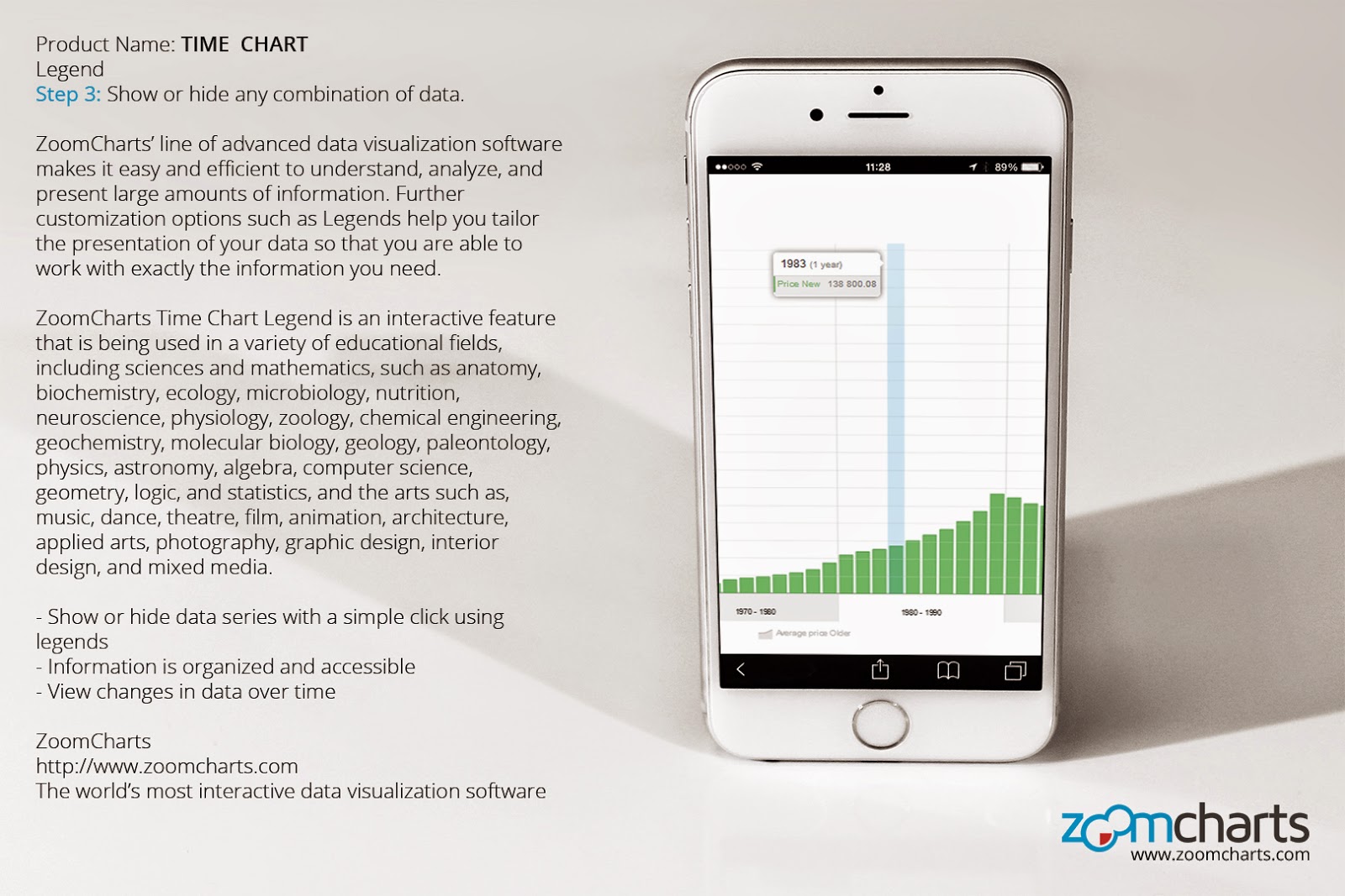
Step 3 Show or hide any combination of data.


Step 4 Sort and display data by various time increments using the filters at the top right.


Step 5 Zoom in and out of the chart by swiping up or down with your mouse scroll pad, or by using the Zoom-out feature at the top left.


Check out ZoomCharts products:

Network Chart
Big network exploration
Explore linked data sets. Highlight relevant data with dynamic filters and visual styles. Incremental data loading. Exploration with focus nodes.

Time Chart
Time navigation and exploration tool
Browse activity logs, select time ranges. Multiple data series and value axes. Switch between time units.

Pie Chart
Amazingly intuitive hierarchical data exploration
Get quick overview of your data and drill down when necessary. All in a single easy to use chart.

Facet Chart
Scrollable bar chart with drill-down
Compare values side by side and provide easy access to the long tail.

ZoomCharts
http://www.zoomcharts.com
The world’s most interactive data visualization software
Monday, February 23, 2015

ZoomCharts Releases New Software Version 1.4

The ZoomCharts team is proud to unveil the newly updated ZoomCharts software, v1.4

We’ve been listening to your feedback and working hard to make your requests a reality. The updated software includes a handful of significant improvements and impressive features, such as the introduction of a new chart type: the Geo Chart.


Version 1.4 upgrade highlights include:
• The new Geo Chart, which allows for visualization of map locations
• Text caching, which makes for faster Net Chart rendering
• A fix for Net Chart label overlapping
• New zooming feature for Net Chart labels, an update from the former fixed width labels
• New radial layout option for Net Charts
• Major updates to documentation
• Bug fixes


ZoomCharts, the world’s most interactive data visualization software, allows you to create completely interactive visual representations of big data sets on all modern devices, at incredibly fast speeds.

ZoomCharts product roster includes:

The Pie Chart, which allows for intuitive hierarchical data exploration, giving you a quick overview of your data and, unlike a traditional pie chart, lets you click on slices to drill down further into information when needed.


The Facet Chart, a modern bar chart that lets you compare data values side by side in one easy to read representation, and where you can drill down deeper when necessary.


The Time Chart, which allows you explore to statistical data within various time ranges, and which supports multiple data series and value axes.


The Network Chart, a completely interactive way to explore linked data sets with movable focus nodes, with features such as incremental data loading and exploration of data using dynamic filters.


The newly unveiled Geo Chart, an interactive map that lets you explore geographical data, allowing you to plot data over specific locations or regions.

Check out our demos that allow you to explore the fully interactive chart experience. The simple click of a mouse or scroll on a track pad lets you zoom in, zoom out, and drill down further into more data.

Become one of the growing number of clients who are discovering the exciting potential that ZoomCharts opens up in analyzing, presenting, and using big data. ZoomCharts’ is supporting data visualization needs in a number of educational fields, including science and mathematics, such as anatomy, biochemistry, ecology, microbiology, nutrition, neuroscience, physiology, zoology, chemical engineering, geochemistry, molecular biology, geology, paleontology, physics, astronomy, algebra, computer science, geometry, logic, and statistics, and the arts such as, music, dance, theatre, film, animation, architecture, applied arts, photography, graphic design, interior design, and mixed media.

For more information on ZoomCharts’ full range of capabilities, please visit https://zoomcharts.com/en

Check out ZoomCharts products:

Network Chart
Big network exploration
Explore linked data sets. Highlight relevant data with dynamic filters and visual styles. Incremental data loading. Exploration with focus nodes.

Time Chart
Time navigation and exploration tool
Browse activity logs, select time ranges. Multiple data series and value axes. Switch between time units.

Pie Chart
Amazingly intuitive hierarchical data exploration
Get quick overview of your data and drill down when necessary. All in a single easy to use chart.

Facet Chart
Scrollable bar chart with drill-down
Compare values side by side and provide easy access to the long tail.

ZoomCharts
http://www.zoomcharts.com
The world’s most interactive data visualization software
Monday, February 16, 2015

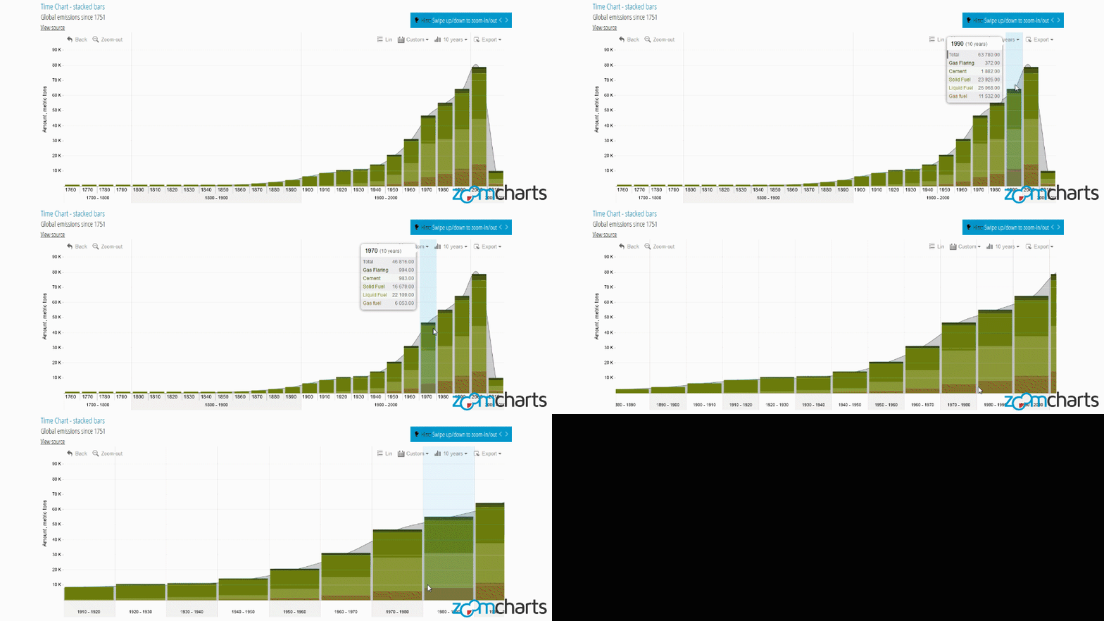
ZoomCharts Time Chart - Stacked Bars for iPhone

https://zoomcharts.com/en/gallery/all:time-chart-stacked-bars-global-emissions


ZoomCharts’ Stacked Bar feature makes reading and comparing information in time charts easy. There is no need to scroll or flip between separate charts. This handy tool makes it possible to view separate data series and detailed information together.

Stacked Bar is one of many ZoomCharts features being used to enhance data visualization in several fields, including science and mathematics, such as anatomy, biochemistry, ecology, microbiology, nutrition, neuroscience, physiology, zoology, chemical engineering, geochemistry, molecular biology, geology, paleontology, physics, astronomy, algebra, computer science, geometry, logic, and statistics, and the arts such as, music, dance, theatre, film, animation, architecture, applied arts, photography, graphic design, interior design, and mixed media.

- View several data series in one chart
- Stacked bars simplify data display
- Data is easy to read and compare


Step 1 Hover over a data series to display detailed information.


Step 2 Click on a data series to expand.


Step 3 Sort and display specific types of data using the filters at the top right.


Step 4 Zoom in and out of the chart by swiping up or down with your mouse scroll pad, or by using the Zoom-out feature at the top left.


Check out ZoomCharts products:

Network Chart
Big network exploration
Explore linked data sets. Highlight relevant data with dynamic filters and visual styles. Incremental data loading. Exploration with focus nodes.

Time Chart
Time navigation and exploration tool
Browse activity logs, select time ranges. Multiple data series and value axes. Switch between time units.

Pie Chart
Amazingly intuitive hierarchical data exploration
Get quick overview of your data and drill down when necessary. All in a single easy to use chart.

Facet Chart
Scrollable bar chart with drill-down
Compare values side by side and provide easy access to the long tail.

ZoomCharts
http://www.zoomcharts.com
The world’s most interactive data visualization software
Monday, February 9, 2015

ZoomCharts Time Chart - Custom Background Image for iPhone

https://zoomcharts.com/en/gallery/all:time-chart-custom-background-image-historical-weather-paris-france


With ZoomCharts’ Custom Background Image feature, you can incorporate custom visuals into your graphs to enhance data presentation. Instead of a bland background, why not support your data with visuals that match your subject matter?

ZoomCharts’ Custom Background Image is an attractive feature currently being used to meet the advanced data visualization needs of various educational fields, including sciences and mathematics, such as anatomy, biochemistry, ecology, microbiology, nutrition, neuroscience, physiology, zoology, chemical engineering, geochemistry, molecular biology, geology, paleontology, physics, astronomy, algebra, computer science, geometry, logic, and statistics, and the arts such as, music, dance, theatre, film, animation, architecture, applied arts, photography, graphic design, interior design, and mixed media.

- Interactive chart that supports large amounts of data
- Chart background can be customized to suit your needs
- Data presentation is functional and visually appealing


Step 1 Customizable images allow you to style your chart background.


Step 2 Hover over time segments to display detailed information.


Step 3 Click on a time segment to expand data.


Step 4 Zoom in and out of the chart by swiping up or down with your mouse scroll pad, or by using the Zoom-out feature at the top left.


Check out ZoomCharts products:

Network Chart
Big network exploration
Explore linked data sets. Highlight relevant data with dynamic filters and visual styles. Incremental data loading. Exploration with focus nodes.

Time Chart
Time navigation and exploration tool
Browse activity logs, select time ranges. Multiple data series and value axes. Switch between time units.

Pie Chart
Amazingly intuitive hierarchical data exploration
Get quick overview of your data and drill down when necessary. All in a single easy to use chart.

Facet Chart
Scrollable bar chart with drill-down
Compare values side by side and provide easy access to the long tail.

ZoomCharts
http://www.zoomcharts.com
The world’s most interactive data visualization software
Friday, January 30, 2015

ZoomCharts Time Chart - Using Dashed Lines for iPhone

https://zoomcharts.com/en/gallery/all:dashed


The possibilities for data analysis are opened up with ZoomCharts’ advanced data visualization software. Start planning for the future today with the Dashed Line tool, one of the many options available in the ZoomCharts line that adds a layer of flexibility to your data presentation.

ZoomCharts’ Dashed Lines feature is enhancing the data visualization needs of various educational fields, including sciences and mathematics, such as anatomy, biochemistry, ecology, microbiology, nutrition, neuroscience, physiology, zoology, chemical engineering, geochemistry, molecular biology, geology, paleontology, physics, astronomy, algebra, computer science, geometry, logic, and statistics, and the arts such as, music, dance, theatre, film, animation, architecture, applied arts, photography, graphic design, interior design, and mixed media.

- Designate between current and proposed figures with separate line styles
- Expand and zoom in and out of data with a simple click or scroll
- Filter and display data according to specific time intervals
- Export data to open in various file types


Step 1 Add forecast data to your timeline and differentiate it using the dashed line style


Step 2 Click on a data item to expand it.


Step 3 Sort and display specific types of data using the filters at the top right.


Step 4 Zoom in and out of the chart by swiping up or down with your mouse scroll pad, or by using the Zoom-out feature at the top left.


Step 5 Go back to the full data display using the Back feature at the top right.


Check out ZoomCharts products:

Network Chart
Big network exploration
Explore linked data sets. Highlight relevant data with dynamic filters and visual styles. Incremental data loading. Exploration with focus nodes.

Time Chart
Time navigation and exploration tool
Browse activity logs, select time ranges. Multiple data series and value axes. Switch between time units.

Pie Chart
Amazingly intuitive hierarchical data exploration
Get quick overview of your data and drill down when necessary. All in a single easy to use chart.

Facet Chart
Scrollable bar chart with drill-down
Compare values side by side and provide easy access to the long tail.

ZoomCharts
http://www.zoomcharts.com
The world’s most interactive data visualization software