ZoomCharts is offering data visualization tools to support participants at The National Institute for Mathematical and Biological Synthesis’ investigative workshop, Neurobiology of Expertise. The event takes place at the University of Tennessee, in Knoxville, TN 37996, from March 11th through March 13th, 2015.
Check out what you can do with ZoomCharts charts and graphs at http://zoomcharts.com
ZoomCharts, the world’s most interactive data visualization software, lets you create fully interactive visual representations of big data sets on modern devices at incredibly fast speeds. Be among the growing number of clients in a variety of educational fields discovering the exciting potential that ZoomCharts software tools opens up for analyzing and presenting your data.
Organized by Frederick Gregory, Neurophysiology of Cognition, U.S. Army Research Office, and Virginia Pasour, Biomathematics, U.S. Army Research Office, NIMBioS’ workshop will focus on the topic of dynamical neurobiological bases of expert performance.
The workshop provides an opportunity for top researchers from diverse fields to share knowledge of multimodal and highly complicated neuroscience datasets. Network sciences and complex systems theory provide an exemplar approach for this analysis.
The objectives of the NIMBioS workshop include identifying challenges of mechanistic modeling, prediction, signal processing, and machine learning in order to uncover underlying neural mechanisms.
Check out ZoomCharts products:
Network Chart
Big network exploration
Explore linked data sets. Highlight relevant data with dynamic filters and visual styles. Incremental data loading. Exploration with focus nodes.
Time Chart
Time navigation and exploration tool
Browse activity logs, select time ranges. Multiple data series and value axes. Switch between time units.
Pie Chart
Amazingly intuitive hierarchical data exploration
Get quick overview of your data and drill down when necessary. All in a single easy to use chart.
Facet Chart
Scrollable bar chart with drill-down
Compare values side by side and provide easy access to the long tail.
ZoomCharts is offering data visualization tools to support speakers at the 29th New England Statistics Symposium, taking place April 24th to 25th, 2015 at the University of Connecticut in Storrs, Connecticut 06269.
Check out what you can do with ZoomCharts charts and graphs at http://zoomcharts.com
The world’s most interactive data visualization software, ZoomCharts lets you create completely interactive visual representations of big data sets on all modern devices at remarkably fast speeds. ZoomCharts tools are being discovered by a growing number of clients in a variety of fields as the best way to analyze and present data. Don’t be among the last to discover the exciting potential that ZoomCharts tools can open up for your data.
The New England Statistics Symposium is hosted by the Department of Statistics at the University of Connecticut. It aims to connect New England statisticians so that they can network with colleagues and share research in emerging issues. Keynote speakers include Yaakov Bar-Shalom of the University of Connecticut and Adrian Raftery of the University of Washington.
The symposium features three full day short courses taking place on April 24th: "Bayesian Biostatistics: Design of Clinical Trials and Subgroup Analysis" by Peter Müller, "Modern Multivariate Statistical Learning: Methods and Applications" by Kun Chen and Jun Yan, and "Boosting R Skills and Automating Statistical Reports" by Yihui Xie.
Check out ZoomCharts products:
Network Chart
Big network exploration
Explore linked data sets. Highlight relevant data with dynamic filters and visual styles. Incremental data loading. Exploration with focus nodes.
Time Chart
Time navigation and exploration tool
Browse activity logs, select time ranges. Multiple data series and value axes. Switch between time units.
Pie Chart
Amazingly intuitive hierarchical data exploration
Get quick overview of your data and drill down when necessary. All in a single easy to use chart.
Facet Chart
Scrollable bar chart with drill-down
Compare values side by side and provide easy access to the long tail.
ZoomCharts is offering data visualization tools to support speakers at the Probability Theory and Combinatorial Optimization conference held by Duke University’s Fuqua School of Business, taking place March 14th to 15th, 2015 in Durham, North Carolina, 27708.
Check out what you can do with ZoomCharts charts and graphs at http://zoomcharts.com
ZoomCharts, the world’s most interactive data visualization software, allows you to create fully interactive, visually appealing representations of big data sets on all modern devices and at incredibly fast speeds. ZoomCharts tools are being discovered by a growing number of clients in a variety of fields as the best way to analyze and present data. Don’t be among the last to discover the exciting potential that ZoomCharts tools can open up for your data.
The Probability Theory and Combinatorial Optimization conference will take place on Pi Day (3/14), and will also provide an opportunity to celebrate J. Michael Steele’s contributions to probability theory and combinatorial optimization in honor of his 65th birthday.
Speakers from prestigious schools are being invited to speak at the conference, including educators from the University of California, Stanford University, McGill University, John Hopkins University, the Massachusetts Institute of Technology, Pompeu Fabra University, the University of Pennsylvania, and Lehigh University.
Sponsors of the event include the National Science Foundation, the Institute of Mathematical Statistics, the Fuqua School of Business at Duke University, and the Wharton School at the University of Pennsylvania.
Check out ZoomCharts products:
Network Chart
Big network exploration
Explore linked data sets. Highlight relevant data with dynamic filters and visual styles. Incremental data loading. Exploration with focus nodes.
Time Chart
Time navigation and exploration tool
Browse activity logs, select time ranges. Multiple data series and value axes. Switch between time units.
Pie Chart
Amazingly intuitive hierarchical data exploration
Get quick overview of your data and drill down when necessary. All in a single easy to use chart.
Facet Chart
Scrollable bar chart with drill-down
Compare values side by side and provide easy access to the long tail.
ZoomCharts is offering data visualization tools to support speakers at Columbia-Princeton Probability Day, taking place Friday, March 6, 2015 at the Princeton University Campus’ Lewis Library, Room 120 in Princeton, New Jersey 08544.
Check out what you can do with ZoomCharts charts and graphs at http://zoomcharts.com
ZoomCharts is the world’s most interactive data visualization software, letting you create fully interactive visual representations of big data sets on modern devices with incredibly fast performance. ZoomCharts tools are being discovered by a growing number of clients in a variety of fields as the best way to analyze and present data. Don’t be among the last to discover the exciting potential that ZoomCharts tools can open up for your data.
Columbia-Princeton Probability Day is free to register. Speakers include Davar Khoshnevisan from the University of Utah, Fraydoun Rezakhanlou from UC Berkley, Prasad Tetali from the Georgia Institute of Technology, and Bálint Virág from the University of Toronto.
Princeton University is the fourth oldest college in the United States and provides esteemed undergraduate and graduate education in the humanities, social sciences, natural sciences, and engineering, including a wide range of courses such as American studies, architecture, chemistry, classics, computer science, creative writing, dance, economics, engineering, English, environmental studies, finance, French, German, Hebrew, history, Italian, Japanese, journalism, Korean, Latin, linguistics, mathematics, molecular biology, music, neuroscience, philosophy, physics, politics, psychology, religion, Russian, sociology, Spanish, urban studies, and visual arts.
Columbia University, the oldest institution of higher learning in the state of New York, offers a variety of areas of study, including anthropology, archeology, astronomy, biochemistry, business, communications, drama and theatre arts, early childhood education, film studies, jazz studies, nursing, political science, Slavic studies, statistics, sustainable development, urban planning, women’s studies, and writing.
Check out ZoomCharts products:
Network Chart
Big network exploration
Explore linked data sets. Highlight relevant data with dynamic filters and visual styles. Incremental data loading. Exploration with focus nodes.
Time Chart
Time navigation and exploration tool
Browse activity logs, select time ranges. Multiple data series and value axes. Switch between time units.
Pie Chart
Amazingly intuitive hierarchical data exploration
Get quick overview of your data and drill down when necessary. All in a single easy to use chart.
Facet Chart
Scrollable bar chart with drill-down
Compare values side by side and provide easy access to the long tail.
ZoomCharts is offering data visualization tools to support speakers at Agile India 2015, taking place March 23rd to March 30th, 2015, at the Chancery Pavilion, No. 135 Residency Road, Bangalore 560025, India.
Check out what you can do with ZoomCharts charts and graphs at http://zoomcharts.com
ZoomCharts is the world’s most interactive data visualization software. Create fully interactive, stunning visual representations of big data sets on modern devices at incredibly fast speeds. Be among the growing number of clients in a variety of professions discovering the exciting potential that ZoomCharts tools opens up for analyzing and presenting data.
The Agile India conference offers an opportunity for agile method enthusiasts to learn, share ideas, and network with other members of the agile community. The conference is aimed to provide a rich experience for attendees, focusing on building a sustainable community that favors quality over quantity, with the intent of providing an equal opportunity for conference presenters.
Agile India is presented by the Agile Software Community of India (ASCI), a registered society of Agile Software Development practitioners.
Part of the event features pre and post conference workshops given by international speakers, including Coaching for “Best Fit” Agile: Applying the Agile Fluency Model by Diana Larsen, MicroServices: Let’s Build Some! By Fred George, Disciplined Agile Delivery in a Nutshell by Mark Lines, Understanding and Implementing DevOps Flow by Yuval Yeret, Suceeding with BDD by Aslak Hellesoy, and Passionate ProductOwner (SCPO) by Jeff Patton.
Previous Agile India conferences have been extremely successful, having held thousands of attendees from dozens of countries all over the world, such as India, Sri Lanka, Singapore, Malaysia, Australia, the United States, the United Kingdom, China, and many more. This year, there is expected to be over 1300 participants in attendance. Previous conference sponsors have included companies such as Hewlett Packard, Siemens, GitHub and General Electric. This year’s sponsors include J.P. Morgan, Innovation Roots, and Scrum Alliance.
Check out ZoomCharts products:
Network Chart
Big network exploration
Explore linked data sets. Highlight relevant data with dynamic filters and visual styles. Incremental data loading. Exploration with focus nodes.
Time Chart
Time navigation and exploration tool
Browse activity logs, select time ranges. Multiple data series and value axes. Switch between time units.
Pie Chart
Amazingly intuitive hierarchical data exploration
Get quick overview of your data and drill down when necessary. All in a single easy to use chart.
Facet Chart
Scrollable bar chart with drill-down
Compare values side by side and provide easy access to the long tail.
The ZoomCharts team is proud to unveil the newly updated ZoomCharts software, v1.4
We’ve been listening to your feedback and working hard to make your requests a reality. The updated software includes a handful of significant improvements and impressive features, such as the introduction of a new chart type: the Geo Chart.
Version 1.4 upgrade highlights include:
• The new Geo Chart, which allows for visualization of map locations
• Text caching, which makes for faster Net Chart rendering
• A fix for Net Chart label overlapping
• New zooming feature for Net Chart labels, an update from the former fixed width labels
• New radial layout option for Net Charts
• Major updates to documentation
• Bug fixes
ZoomCharts, the world’s most interactive data visualization software, allows you to create completely interactive visual representations of big data sets on all modern devices, at incredibly fast speeds.
ZoomCharts product roster includes:
The Pie Chart, which allows for intuitive hierarchical data exploration, giving you a quick overview of your data and, unlike a traditional pie chart, lets you click on slices to drill down further into information when needed.
The Facet Chart, a modern bar chart that lets you compare data values side by side in one easy to read representation, and where you can drill down deeper when necessary.
The Time Chart, which allows you explore to statistical data within various time ranges, and which supports multiple data series and value axes.
The Network Chart, a completely interactive way to explore linked data sets with movable focus nodes, with features such as incremental data loading and exploration of data using dynamic filters.
The newly unveiled Geo Chart, an interactive map that lets you explore geographical data, allowing you to plot data over specific locations or regions.
Check out our demos that allow you to explore the fully interactive chart experience. The simple click of a mouse or scroll on a track pad lets you zoom in, zoom out, and drill down further into more data.
Become one of the growing number of clients who are discovering the exciting potential that ZoomCharts opens up in analyzing, presenting, and using big data. ZoomCharts’ is supporting data visualization needs in a number of educational fields, including science and mathematics, such as anatomy, biochemistry, ecology, microbiology, nutrition, neuroscience, physiology, zoology, chemical engineering, geochemistry, molecular biology, geology, paleontology, physics, astronomy, algebra, computer science, geometry, logic, and statistics, and the arts such as, music, dance, theatre, film, animation, architecture, applied arts, photography, graphic design, interior design, and mixed media.
For more information on ZoomCharts’ full range of capabilities, please visit https://zoomcharts.com/en
Check out ZoomCharts products:
Network Chart
Big network exploration
Explore linked data sets. Highlight relevant data with dynamic filters and visual styles. Incremental data loading. Exploration with focus nodes.
Time Chart
Time navigation and exploration tool
Browse activity logs, select time ranges. Multiple data series and value axes. Switch between time units.
Pie Chart
Amazingly intuitive hierarchical data exploration
Get quick overview of your data and drill down when necessary. All in a single easy to use chart.
Facet Chart
Scrollable bar chart with drill-down
Compare values side by side and provide easy access to the long tail.
ZoomCharts Co-Founder and CEO Janis Volbergs gave a well received presentation at a UI/UX meetup event to talk about the array of progressive ZoomCharts features available today and the great things the team is coming up with for the near future.
Check out this overview of Volbergs’ presentation to discover why ZoomCharts is a world leader in interactive data visualization software:
The name of our product is ZoomCharts, and what we are producing is ZoomCharts SDK, which is the world’s most interactive data software. We are a new startup established in Latvia just last year. The product, since March of this year, is available for purchase and has been purchased by many different customers from all over the world. The actual product is entirely new data visualization software development GIT, which puts in the center not the technology, but the person sitting behind the device that every one of us has in the pockets; users of mobile phones, users of iPads.
We wanted to make such a development toolkit that would allow developers to create interfaces that make it easy to access data, to analyze data, to interact with data. We are not a library that lets you create a chart, we are a library that lets you create an interface that then engages the user into an immersive, interactive data exploration venture.
To give you an idea of what sort of visualizations you can achieve using our development kit, we have products like the network chart. The network chart lets you visualize different networks of data, whether they are social networks, whether they are Internet of things networks. All of that you can visualize on any device you have, basically, whether it’s an iPhone, iPad, notebook, or touch TV. The interactive time chart lets you access big data with time and explore what happens within specific areas of that data without using any other interface component. We have also reinvented the pie chart and the facet chart.
What makes our SDK unique? First of all, it’s built to make data navigation engaging, so it won’t be just a boring chart or boring interface. It will be interesting for people to actually use your software that would include a ZoomCharts application. We also know that most of you like the performance of the application, so we put a lot of effort in creating this development kit such that it will be super nice looking and super fast on most contemporary devices. We have also added different aspects of how you can visualize different data in a compelling way. And for those of you who already have some applications or products, ZoomCharts helps you sell your product because when we show our products to actual consumers, when they see the interface built with ZoomCharts, they love it, and they can immediately see how they can use it for other purposes. So basically, what we are doing with ZoomCharts is accelerating the emergence of new ideas that couldn’t have been done yesterday because there wasn’t such development yet available.
I could talk a lot about it, but it’s better to show you some real life examples of how we have applied ZoomCharts to tackle some of the issues in the real world. With a product called myinstabank, the Internet account statements show a long boring list, and when you need to see the big picture, you just can’t. All you get is just a list. Normally you would just use the export option to make some Excel charts. We found that we could use our interface to give all this information another meaning in the hands of users. We applied our charts to the already existing data within the Internet banks.
What we have here is a time chart. It shows you data aggregated by timestamps. So if you have any data that has timestamps, you can use the time chart. The picture is where most of the chart libraries end; it is the end product of their libraries. In our case, the chart is just the beginning of your venture because now let’s imagine you wanted to see what happened in the year 2012. What do you have to do? One click. You just click on it, and immediately the chart communicates with the banking database, retrieves more data for that period, and immediately aggregates data. No more dropdowns where you have to pick specific dates or unintuitive actions. The rest of the interface then responds to the time period you have selected. The list is there, but now it’s filtered for that one year you just selected. If you need some other information, just one click, and the interface is communicating back to the server and fetching data. Speaking about the pie charts, they immediately show you where your money is coming from, and how you spent your money. All our charts are interactive, so you can click on any slice to filter out the time chart. I said before that we have reinvented certain aspects of the pie chart and one of the key aspects that we have reinvented is, normally if you have a pie chart, you have a grey area that says “others” and you never know what’s inside there. Well, we have fixed that problem. Just one click and it automatically expands. So now, using one pie chart, you can explore all the data.
All of this is interactive, so on iPad, you can use gestures to swipe in, swipe out, do all sorts of things. All charts come bundled with extensive API, which means that you can combine these charts with other JavaScript components that exist within your application to create an interface and an experience to your user that you are looking forward to. The time chart is big data ready because it comes with a very smart data cache and if you attach it to the data sources that handle a lot of data, whenever you do some navigation, it automatically reflects only data for that particular period of time, so there is no unnecessary data being fetched from your servers. Thus, you keep the loads small, the interface fluid, and the overall experience very nice.
One of the very unique products that we have within ZoomCharts is the network chart component. The network chart component lets you visualize different social, financial and other network structures directly within your device. In this particular example, what we did is fetch a subset of the IMDb database to show you how you can use the network chart to visualize information that is already there but in a totally different way. So imagine you get home and you would like to see a new movie but you are not really sure what you want to look for. You know that you like Al Pacino, so what you do is type in “Al Pacino” and immediately you see the actor and the top movies of his. This is the point where your joy of data exploration begins. With a single tap, you can explore what other actors are involved in that particular movie. And you can continue this exploration until you find content that you’d be happy to consume. What is good here is this moment of trust because you started with Al Pacino, you trust that person, you love movies with him, and now you can see that there is Andy Garcia that is linked to him. So you think, “hmm, if I like Al Pacino, they are linked in this movie together, maybe that’s something worth watching today.” With a right click, you can instantly access more information about the movie, and watch a trailer or buy the movie. So what I’m saying here is, using ZoomCharts as a core component of visual interface, you can let people discover your content, find something they like, and also buy it or consume it. So it’s not just seeing the big picture, but it’s interacting and consuming. And all of this is happening within one interface.
In the next year, we’re also thinking about expanding the charts to let cross device communication, which would mean that you would go home, take your iPad, open up this software, and when you find a movie that you want to watch, you would click ‘buy’ or ‘watch’, and it would start playing on your TV. So, devices would be cross linked through using the ZoomCharts interface.
This chart comes with extensive API so you can apply different filters to the data. For instance, in this particular example, we have applied this IMDb filter here, so if you’re really are not looking at anything below 9, you can click on 9 and see that there are not that many movies within this subset. If you are not that kind of person, you can put the star limit to something smaller, and movies appear.
Another interesting aspect is the time machine within which you can filter out movies that are very old, or on the other hand, you can focus on movies that are contemporary. All of that can be easily configured for your application, for your customers, for your product, as you need it. You can style any aspect of your charts with pictures line, arrows.
Many companies, among which is Hewlett-Packard from the United States have already found usage for their cloud solutions to visualize all sorts of different things.
If you go to our webpage you can see other examples of ways you can use our charts. Our charts can be cross combined in very interesting ways. What you see here is Julia’s social network and who her friends are. You can play around with the network and expand and see what other people are there in real time, but when you click again on Julia, a pie chart pops up and says what social networks Julia is using most. So in this user interface, we are already combining a lot of data that is easily accessible with just a few taps. And it doesn’t stop there. So, she loves Facebook. We can click on Facebook, and the second level of the pie chart comes up. There can be unlimited levels. The second level shows which tags she is using within that social network. So now we know that Julia loves Facebook, and within Facebook, she loves to talk about love. Another thing you can do is click on Love, and you get this interactive time chart that says when exactly she is talking about love on Facebook.
In the close future, in a year or two, we are looking forward to integrating support for a number of new human-machine interfaces that are emerging. We are also looking forward to integrating voice control into our charts so you can easily zoom in, zoom out or do other sorts of navigational things.
There are many new chart types coming up, such as the GeoChart, which will let you easily put those interactive pie charts on a map so you can display different statistics for people within one chart.
We are also looking forward to creating a bunch of cloud services that would enable cross chart communication on the one hand, and other things that I’m not really allowed to tell you now, but there will be some big things that you will hear about.
What is good is availability. As I mentioned before, the software is already available to download on our webpage. You can easily get a 30 day free trial to just play around with it. We are giving away free licenses also for non commercial projects, for students, for charities. But if you have a commercial project you would still need to obtain a developer license.
Check out ZoomCharts products:
Network Chart
Big network exploration
Explore linked data sets. Highlight relevant data with dynamic filters and visual styles. Incremental data loading. Exploration with focus nodes.
Time Chart
Time navigation and exploration tool
Browse activity logs, select time ranges. Multiple data series and value axes. Switch between time units.
Pie Chart
Amazingly intuitive hierarchical data exploration
Get quick overview of your data and drill down when necessary. All in a single easy to use chart.
Facet Chart
Scrollable bar chart with drill-down
Compare values side by side and provide easy access to the long tail.
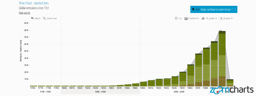
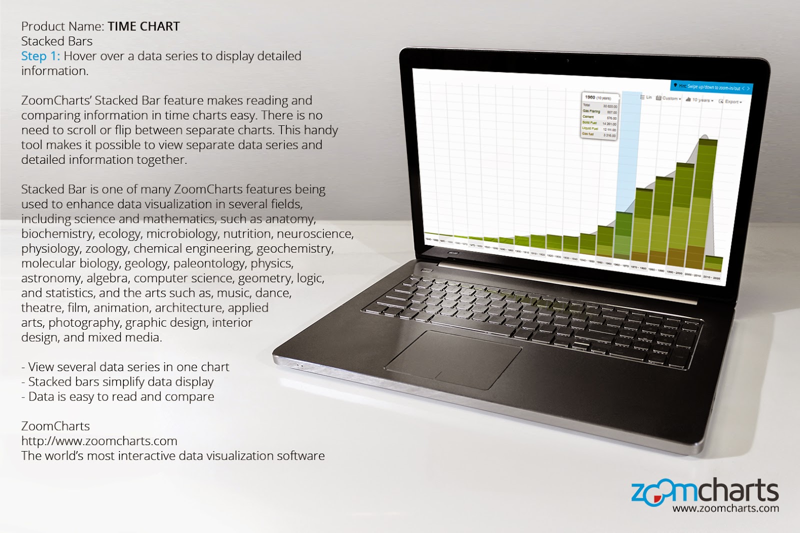
ZoomCharts’ Stacked Bar feature makes reading and comparing information in time charts easy. There is no need to scroll or flip between separate charts. This handy tool makes it possible to view separate data series and detailed information together.
Stacked Bar is one of many ZoomCharts features being used to enhance data visualization in several fields, including science and mathematics, such as anatomy, biochemistry, ecology, microbiology, nutrition, neuroscience, physiology, zoology, chemical engineering, geochemistry, molecular biology, geology, paleontology, physics, astronomy, algebra, computer science, geometry, logic, and statistics, and the arts such as, music, dance, theatre, film, animation, architecture, applied arts, photography, graphic design, interior design, and mixed media.
- View several data series in one chart
- Stacked bars simplify data display
- Data is easy to read and compare
Step 1 Hover over a data series to display detailed information.
Step 2 Click on a data series to expand.
Step 3 Sort and display specific types of data using the filters at the top right.
Step 4 Zoom in and out of the chart by swiping up or down with your mouse scroll pad, or by using the Zoom-out feature at the top left.
Check out ZoomCharts products:
Network Chart
Big network exploration
Explore linked data sets. Highlight relevant data with dynamic filters and visual styles. Incremental data loading. Exploration with focus nodes.
Time Chart
Time navigation and exploration tool
Browse activity logs, select time ranges. Multiple data series and value axes. Switch between time units.
Pie Chart
Amazingly intuitive hierarchical data exploration
Get quick overview of your data and drill down when necessary. All in a single easy to use chart.
Facet Chart
Scrollable bar chart with drill-down
Compare values side by side and provide easy access to the long tail.
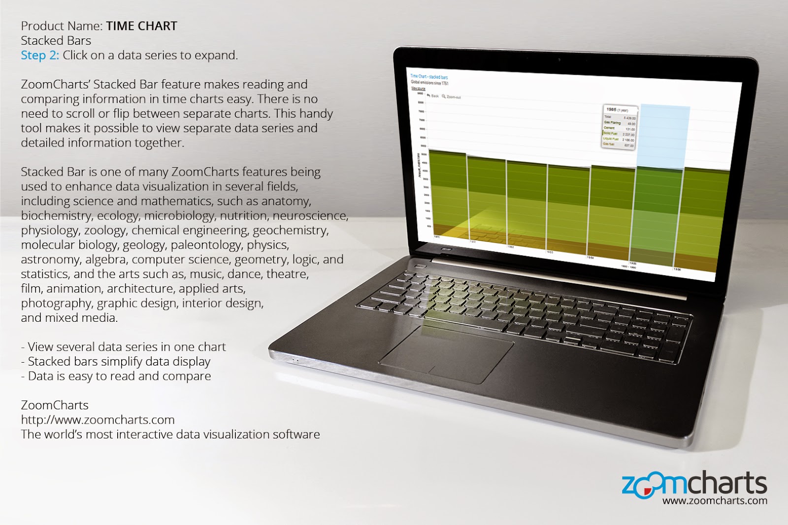
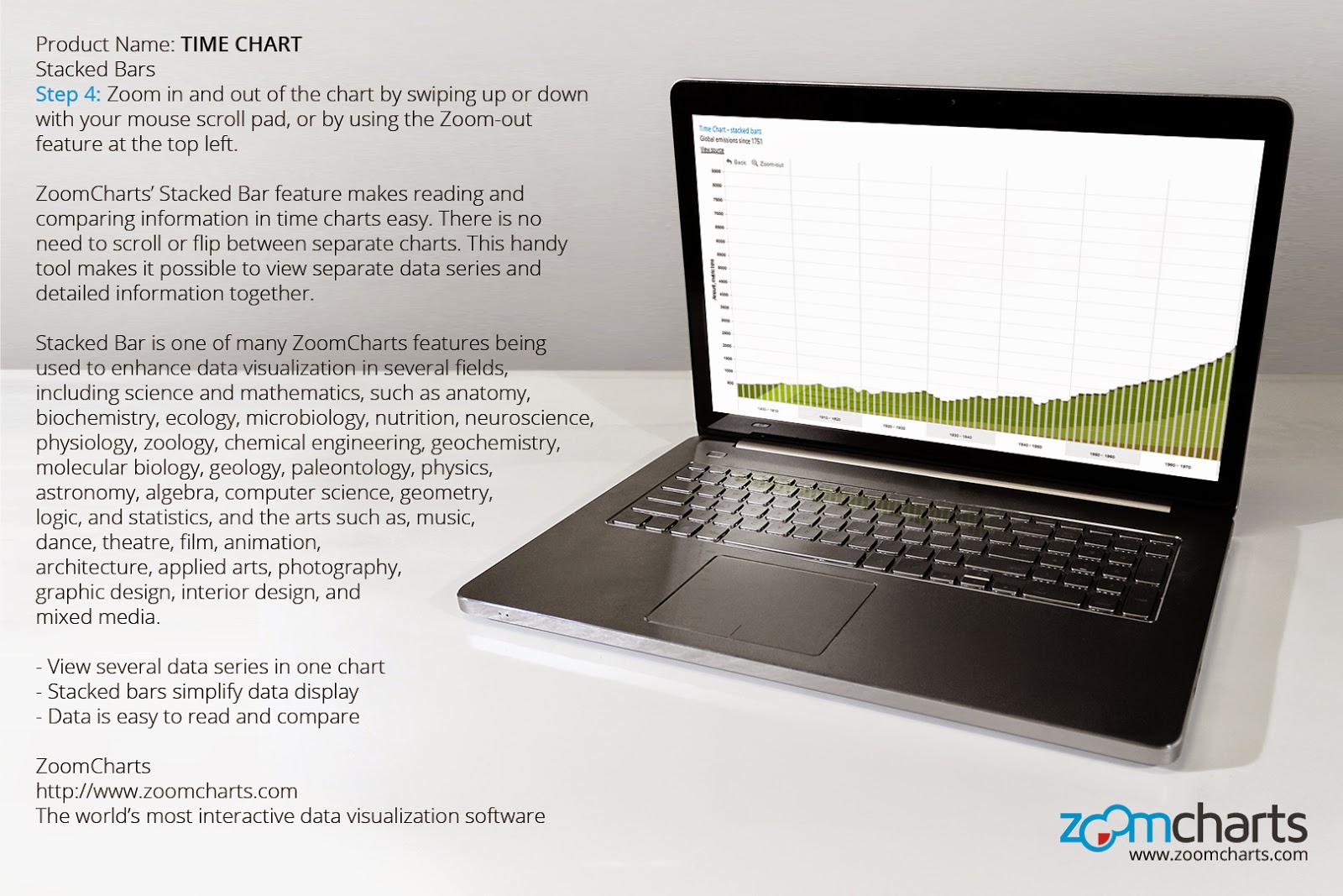
ZoomCharts is offering data visualization tools to support presenters at the Second International Conference on Information Technology, Control, Chaos, Modeling and Applications (ITCCMA-2015), taking place at Vel Tech University, 42 Avadi-Vel Tech Road, Chennai, India, from March 7th to 8th, 2015.
Check out what you can do with ZoomCharts charts and graphs at http://zoomcharts.com
ZoomCharts’ line of advanced data visualization software is fully interactive, supports large data sets, works on all modern devices including touch screens, and does it all at remarkably fast speeds, unmatched by any other visualization software of its kind. These tools are being explored by a growing number of clients in a variety of fields as the best way to analyze and present data. Don’t be among the last to discover the exciting potential that ZoomCharts tools can open up for your data.
ITCCMA-2015 is jointly organized by AIRCC Publishing Corporation’s Computer Science and Information Technology Community (CSITC) and Vel Tech Dr. RR and Dr. SR Technical University in Chennai, India. AIRCC Publishing Corporation is an emerging peer reviewed, academic open access Computer Science and Engineering publisher. The ITCCMA conference aims to provide a platform for researchers and practitioners from Information Technology, Control Systems, Chaos, and Modeling industry and academia to gather and share cutting edge field developments.
ITCCMA is gathering original research paper submissions from topics of interest such as algorithms and applications, artificial intelligence (AI), automation systems, bioinformatics, chaos theory and applications, compiler design, computer architecture and real time systems, computer modeling and applications, control systems, database and data mining, distributed and parallel systems, digital image processing and pattern recognition, digital signal processing, embedded systems and software, evolutionary algorithms and applications, fault detection and isolation, game theory and software engineering, genetic algorithms and evolutionary computing, geographical information systems, green computing, grid computing and scalable computing, hybrid intelligent systems, hyperchaos and applications, information technology and IT management, intelligent systems, mobile and ubiquitous computing, modeling and simulation of systems, multimedia systems and services, networking and communications, neural networks and fuzzy Logic, operating systems, programming languages and performance evaluation, remote sensing, robotics and applications, scientific and financial computing, security and information systems, signal and image processing, soft computing techniques, software engineering, speech synthesis, system identification and control, theoretical computer science, Web technology, and wireless communications systems.
Check out ZoomCharts products:
Network Chart
Big network exploration
Explore linked data sets. Highlight relevant data with dynamic filters and visual styles. Incremental data loading. Exploration with focus nodes.
Time Chart
Time navigation and exploration tool
Browse activity logs, select time ranges. Multiple data series and value axes. Switch between time units.
Pie Chart
Amazingly intuitive hierarchical data exploration
Get quick overview of your data and drill down when necessary. All in a single easy to use chart.
Facet Chart
Scrollable bar chart with drill-down
Compare values side by side and provide easy access to the long tail.
ZoomCharts is offering data visualization tools to support presentations at DRIVE/, taking place from March 11th to 12th, 2015 at the Hyatt Regency Bellevue on Seattle’s Eastside in Seattle/Bellevue, Washington.
Check out what you can do with ZoomCharts charts and graphs at http://zoomcharts.com
ZoomCharts’ line of advanced data visualization software is fully interactive, supports big data, works on all modern devices including touch screens, and does it all at incredibly fast speeds. These tools are being discovered by a growing number of clients in a variety of fields as the best way to analyze and present data. Don’t be among the last to discover the exciting potential that ZoomCharts tools can open up for your data.
DRIVE/ is an annual event attended by wide range of innovative IT and data professionals including higher education, non profit, and corporate sectors, such as Amazon, Adobe, Yale University, Harvard University, Columbia University, Bill & Melinda Gates Foundation, American Red Cross, Seattle Children’s Hospital, and many more. Experts in subjects such as data, reporting, information, analytics, modeling, and visualization speak and present for participants to learn new skills, participate, and be inspired by all things high tech.
Check out ZoomCharts products:
Network Chart
Big network exploration
Explore linked data sets. Highlight relevant data with dynamic filters and visual styles. Incremental data loading. Exploration with focus nodes.
Time Chart
Time navigation and exploration tool
Browse activity logs, select time ranges. Multiple data series and value axes. Switch between time units.
Pie Chart
Amazingly intuitive hierarchical data exploration
Get quick overview of your data and drill down when necessary. All in a single easy to use chart.
Facet Chart
Scrollable bar chart with drill-down
Compare values side by side and provide easy access to the long tail.
ZoomCharts is offering data visualization tools to support speakers at the Big Data Developer Conference, taking place from April 25th to 26th, 2015 at the Children’s Creativity Museum in San Francisco, California.
Check out what you can do with ZoomCharts charts and graphs at http://zoomcharts.com
ZoomCharts’ line of advanced data visualization software is fully interactive, supports big data, works on all modern devices including touch screens, and does it all at incredibly fast speeds. These tools are being discovered by a growing number of clients in a variety of fields as the best way to analyze and present data. Don’t be among the last to discover the exciting potential that ZoomCharts tools can open up for your data.
360|intersect is an innovative alternative to the regular tech gathering. It is a one of a kind event aimed to connect speakers and attendees in technology and design to share stories and to inspire other members of the community. Now in its third year, and featuring two days of inspirational talks, presenters include designers, developers, coders, writers, researchers, artists, and supporters of open source.
Check out ZoomCharts products:
Network Chart
Big network exploration
Explore linked data sets. Highlight relevant data with dynamic filters and visual styles. Incremental data loading. Exploration with focus nodes.
Time Chart
Time navigation and exploration tool
Browse activity logs, select time ranges. Multiple data series and value axes. Switch between time units.
Pie Chart
Amazingly intuitive hierarchical data exploration
Get quick overview of your data and drill down when necessary. All in a single easy to use chart.
Facet Chart
Scrollable bar chart with drill-down
Compare values side by side and provide easy access to the long tail.
ZoomCharts is offering data visualization tools to support presenters at the Fifth International Conference on Computer Science, Engineering and Applications (ICCSEA-2015), May 23rd to 24th in Delhi, India.
Check out what you can do with ZoomCharts charts and graphs at http://zoomcharts.com
ZoomCharts’ line of advanced data visualization software is fully interactive, supports massive amounts of data, works with all modern devices including touch screens, and does it all at an incredibly fast speed, unmatched by any other visualization software of its kind. These tools are being explored by a growing number of clients in a variety of fields as the best way to analyze and present data. Don’t be among the last to discover the exciting potential that ZoomCharts tools can open up for your data.
Organized by AIRCC Publishing Corporation, an emerging peer reviewed, academic open access Computer Science and Engineering publisher, ICCSEA’s aim is to provide a platform for researchers and practitioners in academia and industry to gather and share cutting edge field developments. The conference will provide a forum for exploring significant contributions to major computer science and information technology fields, and to share knowledge and results in theory, methodology, and applications of computer science, engineering, and applications.
ICCSEA is accepting authors’ original research paper submissions that illustrate research results, projects, surveying works, and industrial experiences describing significant advances in areas such as algorithms and bioinformatics, computer architecture and real time systems, database and data mining, dependable, reliable, and autonomic computing, distributed and parallel systems and algorithms, DSP/image processing/pattern recognition/multimedia, embedded system and software, game and software engineering, geographical information systems/global navigation satellite systems (GIS/GNSS), grid and scalable computing, intelligent information and database systems, mobile and ubiquitous computing, modeling and simulation, multimedia systems and services, networking and communications, performance evaluation, programming languages, security and information assurance, soft computing (AI, neural networks, fuzzy systems, etc.), software engineering, web and Internet computing, theoretical computer science, natural language processing, operating systems, compiler design, and computer education.
Check out ZoomCharts products:
Network Chart
Big network exploration
Explore linked data sets. Highlight relevant data with dynamic filters and visual styles. Incremental data loading. Exploration with focus nodes.
Time Chart
Time navigation and exploration tool
Browse activity logs, select time ranges. Multiple data series and value axes. Switch between time units.
Pie Chart
Amazingly intuitive hierarchical data exploration
Get quick overview of your data and drill down when necessary. All in a single easy to use chart.
Facet Chart
Scrollable bar chart with drill-down
Compare values side by side and provide easy access to the long tail.
ZoomCharts is offering data visualization tools to support presenters at the International Conference on Data Mining and Applications (DMAP 2015), taking place March 28-29th, 2015 at Bangalore University, Mysore Road, Jnana Bharathi Campus Bengaluru, Karnataka 560056 Bangalore, India.
Check out what you can do with ZoomCharts charts and graphs at http://zoomcharts.com
ZoomCharts’ line of advanced data visualization software is completely interactive, supports big data, works on all modern devices including touch screens, and does it all at fast speeds unmatched by any other visualization software of its kind. These tools are being explored by a growing number of clients in a variety of fields as the best way to analyze and present data. Don’t be among the last to discover the exciting potential that ZoomCharts tools can open up for your data.
Hosted by AIRCC Publishing Corporation, an emerging peer reviewed, academic open access Computer Science and Engineering publisher, DMAP is a conference that provides researchers the opportunity to present their work on significant advances in data mining and applications in a peer-reviewed forum. DMAP gathers original research paper submissions on topics of interest such as data mining applications, data mining in modeling, visualization, personalization, and recommendation, data mining systems and platforms, efficiency, scalability, and privacy, foundations, algorithms, models, and theory, mining text, semi-structured, spatio-temporal, streaming, graph, web, multimedia, and knowledge processing. The proceedings will be published by Computer Science Conference Proceedings in Computer Science & Information Technology (CS & IT).
Check out ZoomCharts products:
Network Chart
Big network exploration
Explore linked data sets. Highlight relevant data with dynamic filters and visual styles. Incremental data loading. Exploration with focus nodes.
Time Chart
Time navigation and exploration tool
Browse activity logs, select time ranges. Multiple data series and value axes. Switch between time units.
Pie Chart
Amazingly intuitive hierarchical data exploration
Get quick overview of your data and drill down when necessary. All in a single easy to use chart.
Facet Chart
Scrollable bar chart with drill-down
Compare values side by side and provide easy access to the long tail.
ZoomCharts is offering data visualization tools to support presenters at the SAP TechEd Bangalore 2015 conference, March 11-13th, 2015 at the Bangalore International Exhibition Centre, 10th Mile, Tumkur Road, Madavara Post, Bangalore 562 123, India.
Check out what you can do with ZoomCharts charts and graphs at http://zoomcharts.com
ZoomCharts’ line of advanced data visualization software is fully interactive, supports massive amounts of data, works with all modern devices including touch screens, and does it all at an incredibly fast speed, unmatched by any other visualization software of its kind. These tools are being explored by a growing number of clients in a variety of fields as the best way to analyze and present data. Don’t be among the last to discover the exciting potential that ZoomCharts tools can open up for your data.
As an information technology leader that is home to industries such as software and telecommunications, and as Asia’s fastest growing cosmopolitan city, Bangalore is India’s answer to Silicon Valley. SAP TechEd Bangalore 2015 will be host to thousands of developers, engineers, and tech professionals, offering lectures and workshops on topics such as analytics, big data, mobile, user experience, cloud management, security, and more. Some highlights of the event include keynote speakers, live coding events, product demos, and the chance to connect and network with speakers, mentors, developers, and IT experts.
Check out ZoomCharts products:
Network Chart
Big network exploration
Explore linked data sets. Highlight relevant data with dynamic filters and visual styles. Incremental data loading. Exploration with focus nodes.
Time Chart
Time navigation and exploration tool
Browse activity logs, select time ranges. Multiple data series and value axes. Switch between time units.
Pie Chart
Amazingly intuitive hierarchical data exploration
Get quick overview of your data and drill down when necessary. All in a single easy to use chart.
Facet Chart
Scrollable bar chart with drill-down
Compare values side by side and provide easy access to the long tail.
Part of the ZoomCharts team, including CEO and Co-Founder Janis Volbergs, enjoy themselves while manning the ZoomCharts demo booth at the highly successful TechChill Baltics 2015 technology startup conference on February 10, 2015 at the Palladium concert hall in Riga, Latvia.
Check out ZoomCharts products:
Network Chart
Big network exploration
Explore linked data sets. Highlight relevant data with dynamic filters and visual styles. Incremental data loading. Exploration with focus nodes.
Time Chart
Time navigation and exploration tool
Browse activity logs, select time ranges. Multiple data series and value axes. Switch between time units.
Pie Chart
Amazingly intuitive hierarchical data exploration
Get quick overview of your data and drill down when necessary. All in a single easy to use chart.
Facet Chart
Scrollable bar chart with drill-down
Compare values side by side and provide easy access to the long tail.
Andrew Hoag, President of Ferocia, Inc., a product building company, gives an enlightening presentation at the highly successful TechChill Baltics 2015 tech startup conference on February 10, 2015.
Andrew Hoag, President of Ferocia, Inc., speaks about fundraising as part of his intriguing presentation at the TechChill Baltics 2015 tech startup conference on February 10 at the Palladium concert hall in Riga, Latvia.
Co-Founder of TechHub Riga, Andris K. Berzins begins his presentation on stage at TechChill Baltics 2015 on January 10th at the Palladium concert hall in Riga, Latvia.
David Bizer, Partner at European boutique recruitment and talent management consulting firm Talent Fountain, gave a highly entertaining presentation to a riveted audience at the TechChill Baltics 2015 tech startup conference in Riga, Latvia.
Guests at the TechChill Baltics 2015 technology startup conference, which took place on February 10, 2015 at the Palladium concert hall in Riga, Latvia, enjoy themselves with the latest tech gear.
ZoomCharts CEO and Co-Founder Janis Volbergs gives an interactive demonstration of ZoomCharts products to a group of interested guests at the ZoomCharts demo booth during the TechChill Baltics 2015 tech startup conference.
Part of the ZoomCharts team, including CEO and Co-Founder Janis Volbergs, enjoy themselves while manning the ZoomCharts demo booth at the highly successful TechChill Baltics 2015 technology startup conference on February 10, 2015 at the Palladium concert hall in Riga, Latvia.
Jon Bradford, Managing Director of London-based tech startup support company TechStars, speaks of some of the challenges facing startup companies at TechChill Baltics 2015 in Riga, Latvia.
A speaker introduces the next presenter on stage at the TechChill Baltics 2015 emerging technology conference, which took place on February 10 at the Palladium concert hall in Riga, Latvia.
Guests at the TechChill Baltics 2015 technology startup conference take a break from all the excitement in front of the ZoomCharts demo booth at the Palladium concert hall in Riga, Latvia.
The TechChill Baltics 2015 technology startup conference on February 10, 2015 at the Palladium concert hall in Riga, Latvia, featured some major tech sponsors and supporters, such as Microsoft, IBM, and Samsung.
Jon Bradford, Managing Director of London-based tech startup support company TechStars, speaks on stage at the highly successful TechChill Baltics 2015 conference on February 10, 2015 at the Palladium concert hall in Riga, Latvia.
A vibrant ZoomCharts presentation board is ready to be explored at the ZoomCharts demo booth at the very successful TechChill Baltics 2015 technology startup conference on February 10, 2015 at the Palladium concert hall in Riga, Latvia.
ZoomCharts CEO and Co-Founder Janis Volbergs demonstrates the vast capabilities of a network chart to an intrigued guest at the ZoomCharts demo booth during the TechChill Baltics 2015 tech startup conference.
A ZoomCharts presentation graces the screen at the popular ZoomCharts demo booth at the TechChill Baltics 2015 technology startup conference on February 10, 2015 at the Palladium concert hall in Riga, Latvia.
Check out ZoomCharts products:
Network Chart
Big network exploration
Explore linked data sets. Highlight relevant data with dynamic filters and visual styles. Incremental data loading. Exploration with focus nodes.
Time Chart
Time navigation and exploration tool
Browse activity logs, select time ranges. Multiple data series and value axes. Switch between time units.
Pie Chart
Amazingly intuitive hierarchical data exploration
Get quick overview of your data and drill down when necessary. All in a single easy to use chart.
Facet Chart
Scrollable bar chart with drill-down
Compare values side by side and provide easy access to the long tail.